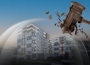
Four years ago, Veritasi Homes was created with the vision to solve a problem- the housing deficit in Nigeria. Backed up by the drive to make this happen, we started from the beginning. We have evolved from landed projects; “Starcity gardens and the Claridge”, to our best project yet, “The Camberwall development project”.
The Camberwall development project was implemented to provide world-class homes across different socio-economic classes, from affordable to high-end luxury homes.
We have walked through challenges posed by several factors including; the uncertainty of the Nigerian economy, the COVID-19 pandemic, and emerged bigger, better, and stronger.
However, the time has come for us to start a new phase in our journey, “A transition to a new level”. Metamorphosis comes in stages, and we are in one of those stages.
THE TRANSITION
For us, the rebrand is not only a change of our logo or identity, it is an overall upscale in our operations, mode of communication, the standard of service delivery, and more. We are moving towards bigger projects and broadening our scope in solving the housing deficit problem in Nigeria.
One of the key steps we’ve taken to effect this change is the creation of our sister company, Eystone Development. Eystone Development was created to meet the needs of clients and investors in the mass market interested in owning low-cost homes. This will appeal to Nigerians in the economic landscape who want to invest in affordable homes. Eystone will also be a driving force to the vision of the company in providing affordable housing.
LOGO & TAGLINE
It was a decisive move to transform the logo, from a roof, which represents shelter, a home, to a multi-dimensional logo. The new logo has multiple meanings, as it relates to our value and vision for Veritasi Homes.
The red symbol of the new logo is called THE RED ARC.
As it relates to our vision, this is a symbol of shelter, protection, security, and safety, against economic insecurities. This also symbolizes the building blocks, which reflect what we do, (real estate, construction, and advisory).
The new logo also takes the shape of a key, which is in line with our goal of delivering keys of quality and state-of-the-art homes to new homeowners. The key also symbolizes us providing access to endless opportunities. This is critical, as the value we provide makes room for others to create eminent value.
The brand colours, grey and red, were purposefully chosen, as it speaks to the current state of the brand. The grey symbolizes; our practicality, maturity, reliability, and elegance in our operations and value delivery. The red whilst complementing the grey colour showcases our courage, confidence, and vigour to take action. It also displays our doggedness to always challenge ourselves to do better.
Our tagline is Creating Better.
In our steady growth and continuous drive to improve on our value, we keep innovating to Create Better. Creating better communities, values, spaces, innovations, services, and more.
MOVING FORWARD
As we kick-start this new phase of our journey, we are upscaling to bigger projects. Enlarging our scope to the areas we are covering in the city of Lagos. New luxury development projects will soon kick off at Ikate and Ikoyi. Be expectant of nothing short of elegance, glamour, and grandeur.


